

Project 010
Prior Foundry - Motion & Identity
Policy designed arouned people.
Prior Foundry came to us for their first-ever brand. What started as a branding project grew into a full brand sprint — messaging, tone of voice, and a cohesive motion identity to bring it all to life.
We began by getting to the core of their story: what is Prior Foundry's mission, and how does that translate into their brand?
From there, we delivered the foundational building blocks — a core identity, toolkits, and presentable pitch decks. Great collaborating with the team across San Francisco and Paris, from the very start.
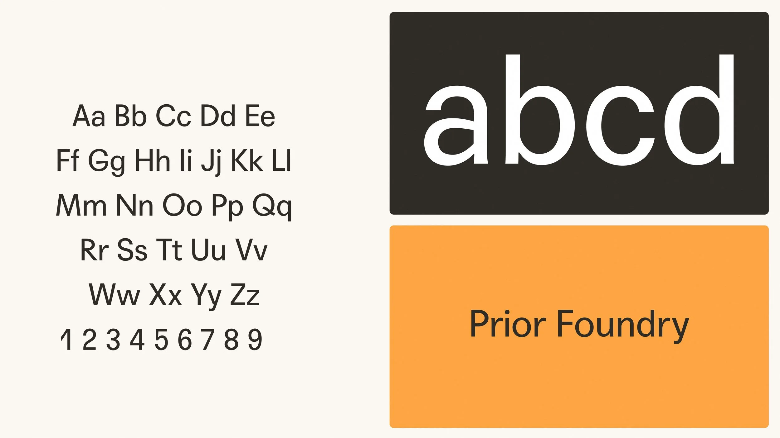

Translating this into a proper design language meant making sure Prior Foundry's core audience would instantly understand it: informative and sleek, yet warm and human. We anchored the process in three questions: why, how, and what. From there, we defined a brand personality that's human, responsible, and credible.
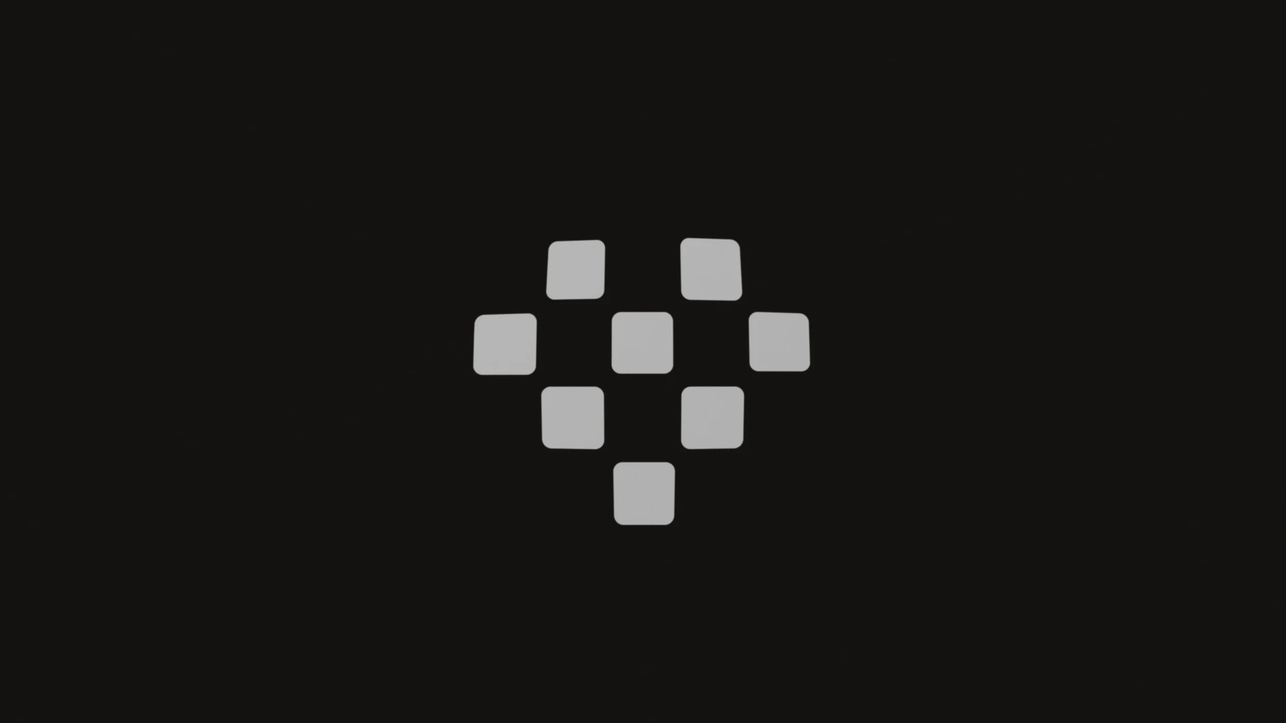
For the logo, research was our starting point. The mark brings research elements together into an abstract heart: a nod to policy work that's analytical in process but human in its outcome.
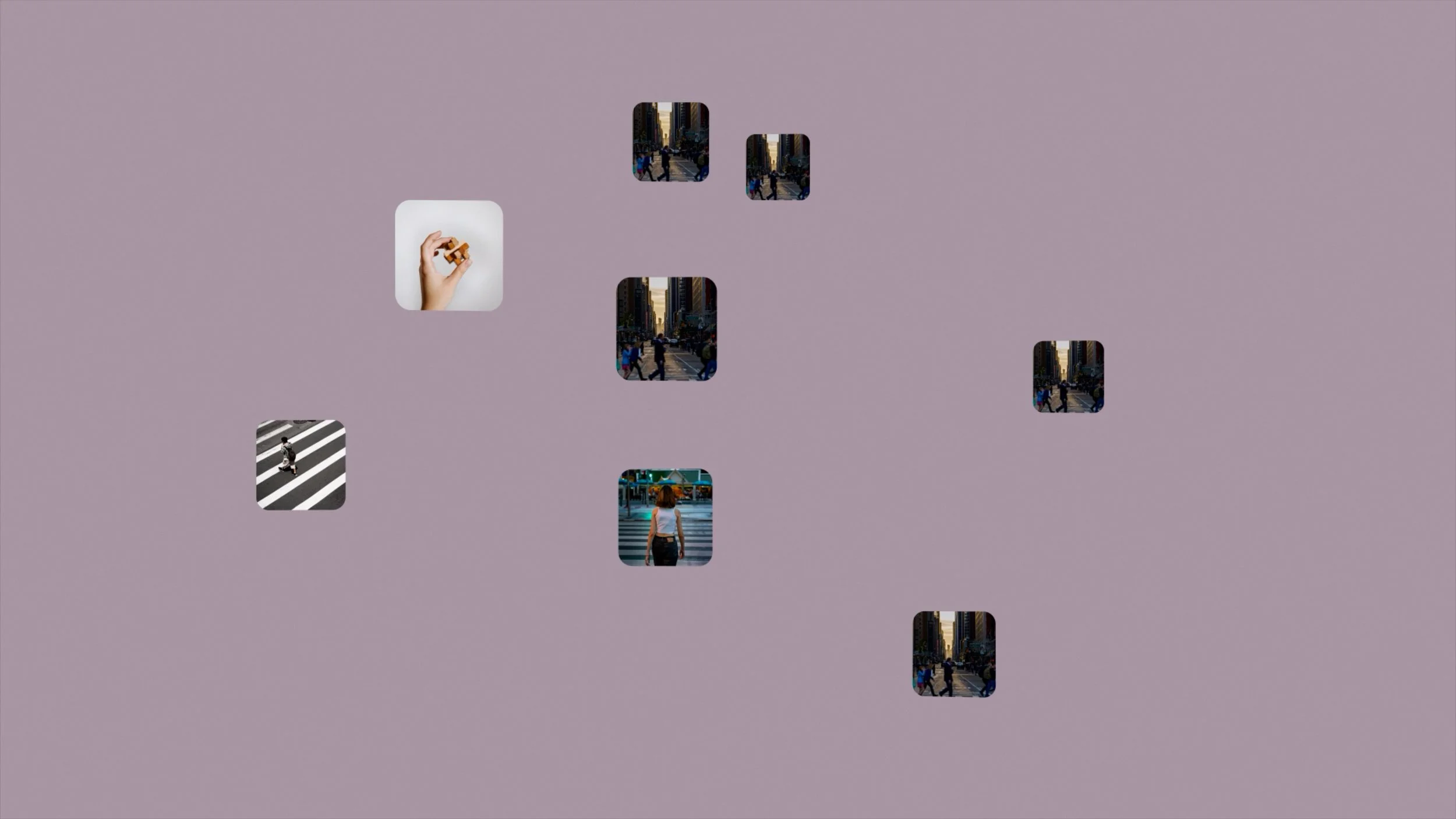
Structured clarity shaped the visual system: a focus on tech, hierarchy, and calm layouts that make complex information easier to read, compare, and understand.
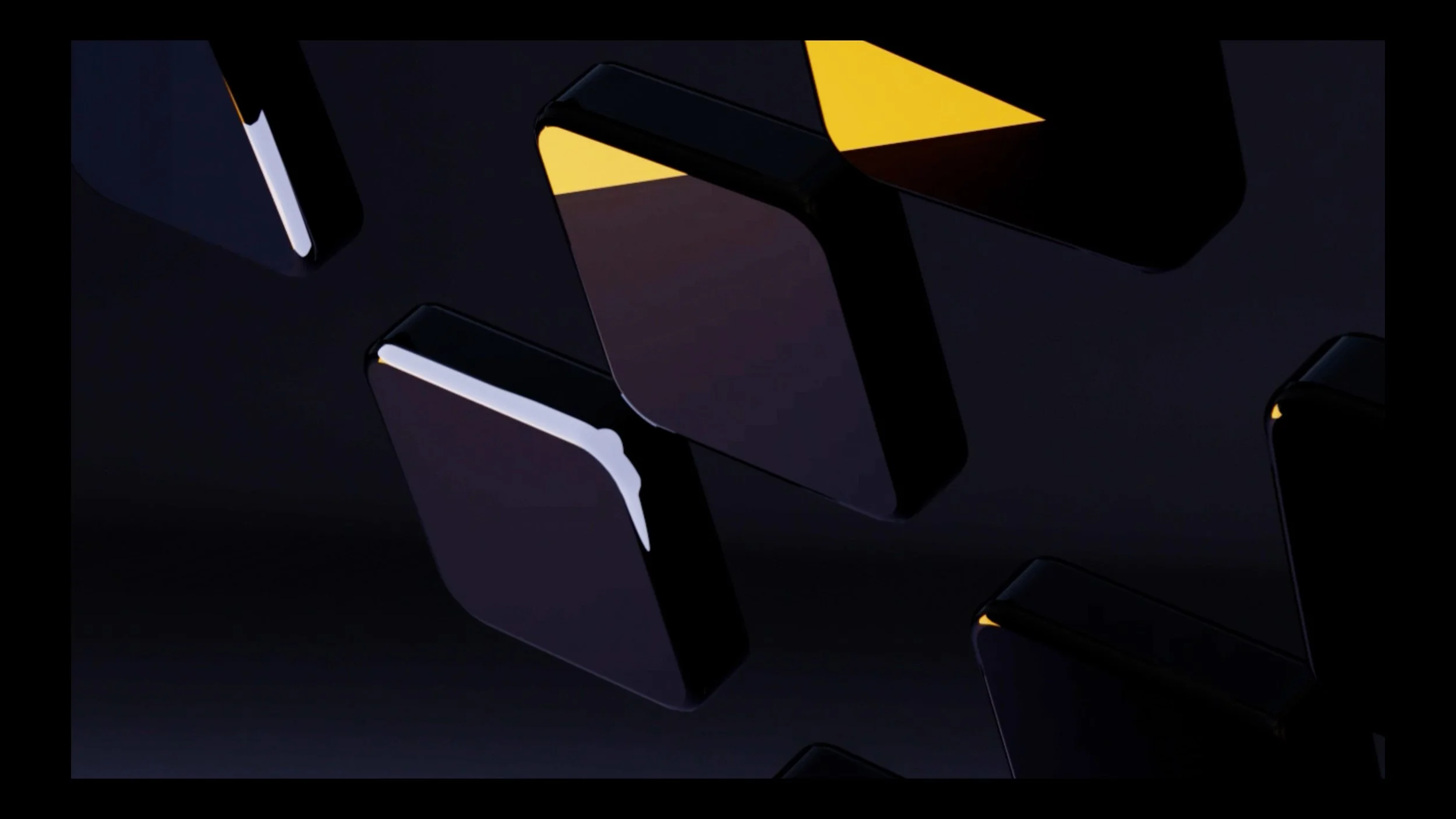
Motion needed to be playful and clear: character-driven, smooth and snappy easing, purposeful movement that accentuates Prior Foundry's foundations rather than distracts from them.
The result is a visual identity built on research and careful policy work, one that balances human impact with technical credibility and trust. A research-driven look and feel meets warmth: muted, warm colors paired with a clear, tech-forward signal color. Typography has character while staying clear and suited for a digital, AI-powered tool. Layouts stay clean, structured, and calm throughout.